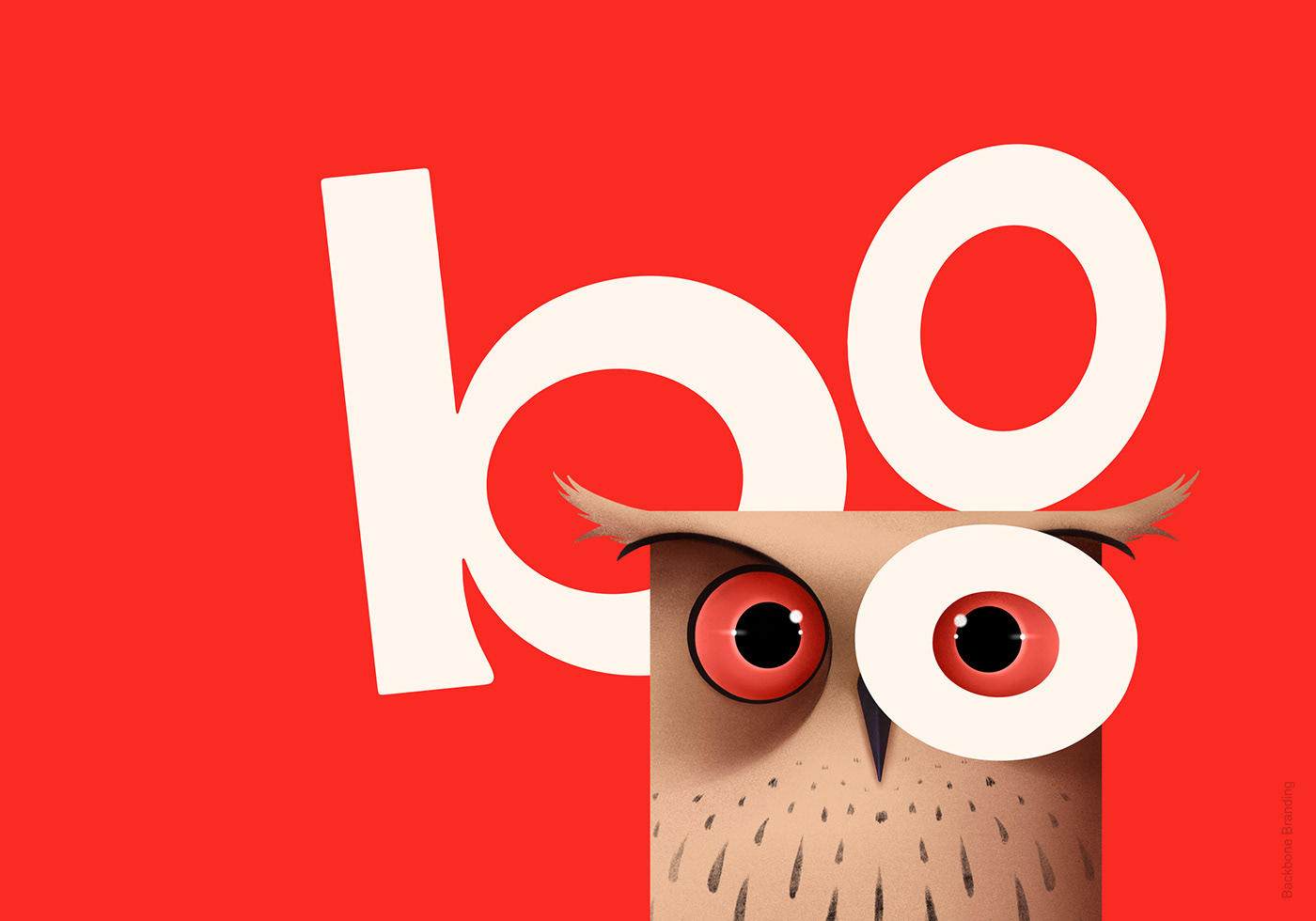
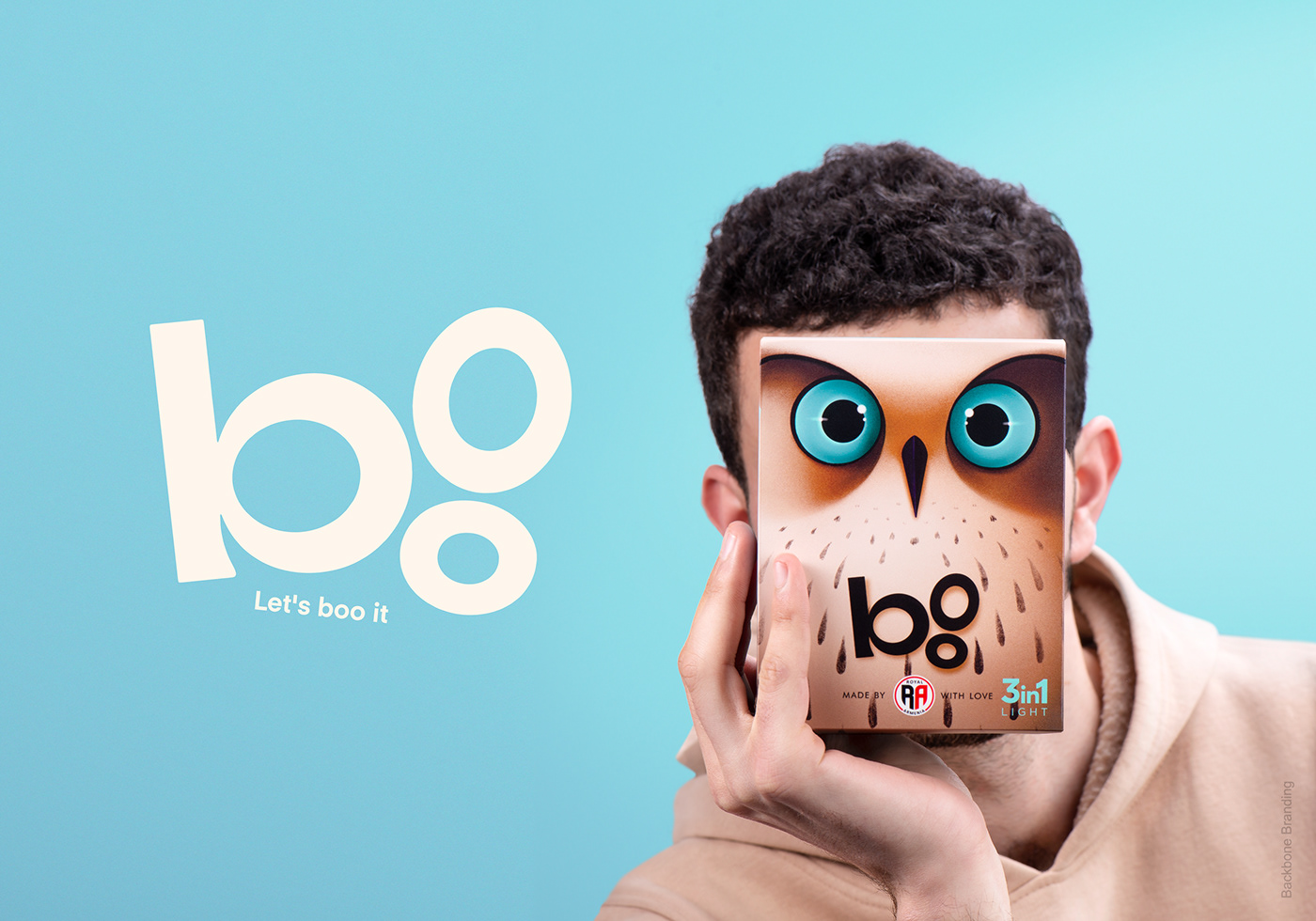
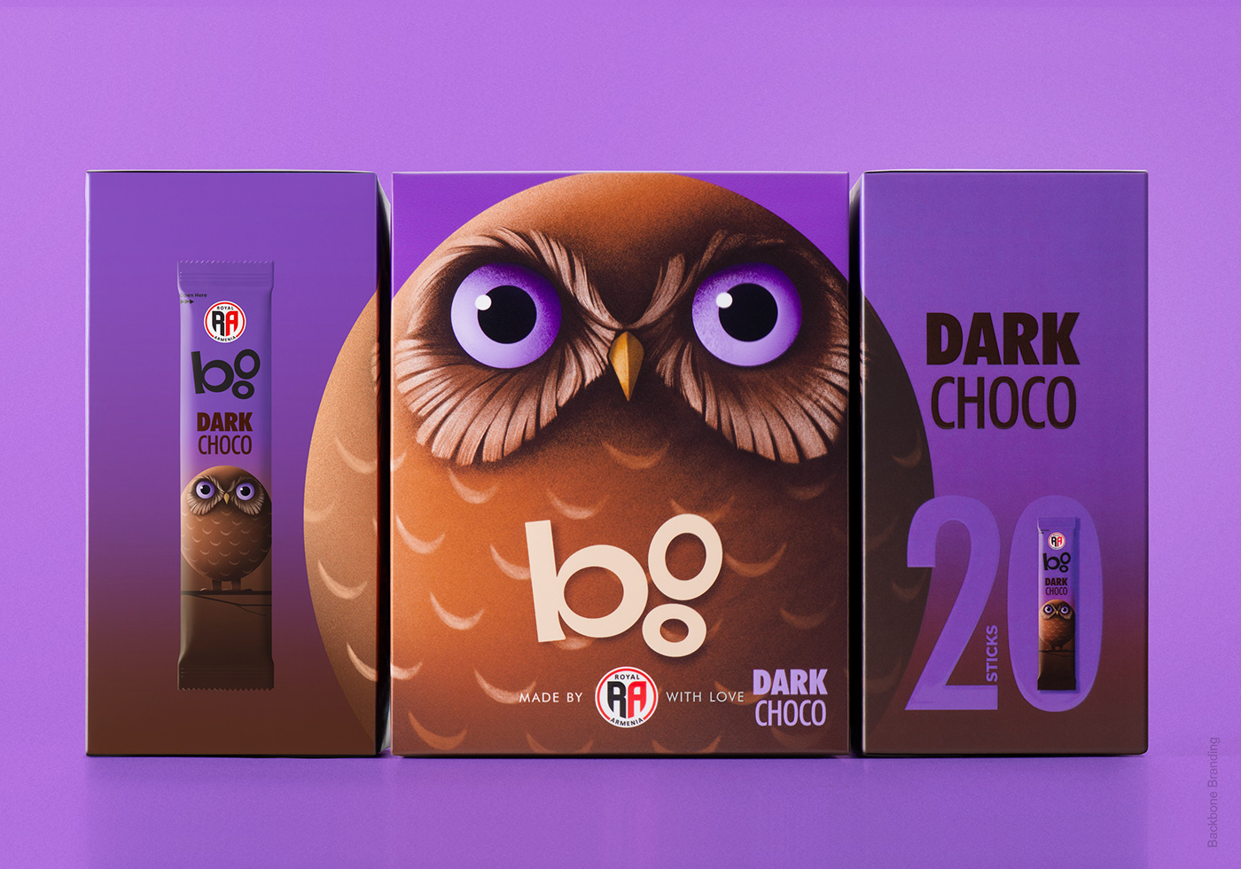
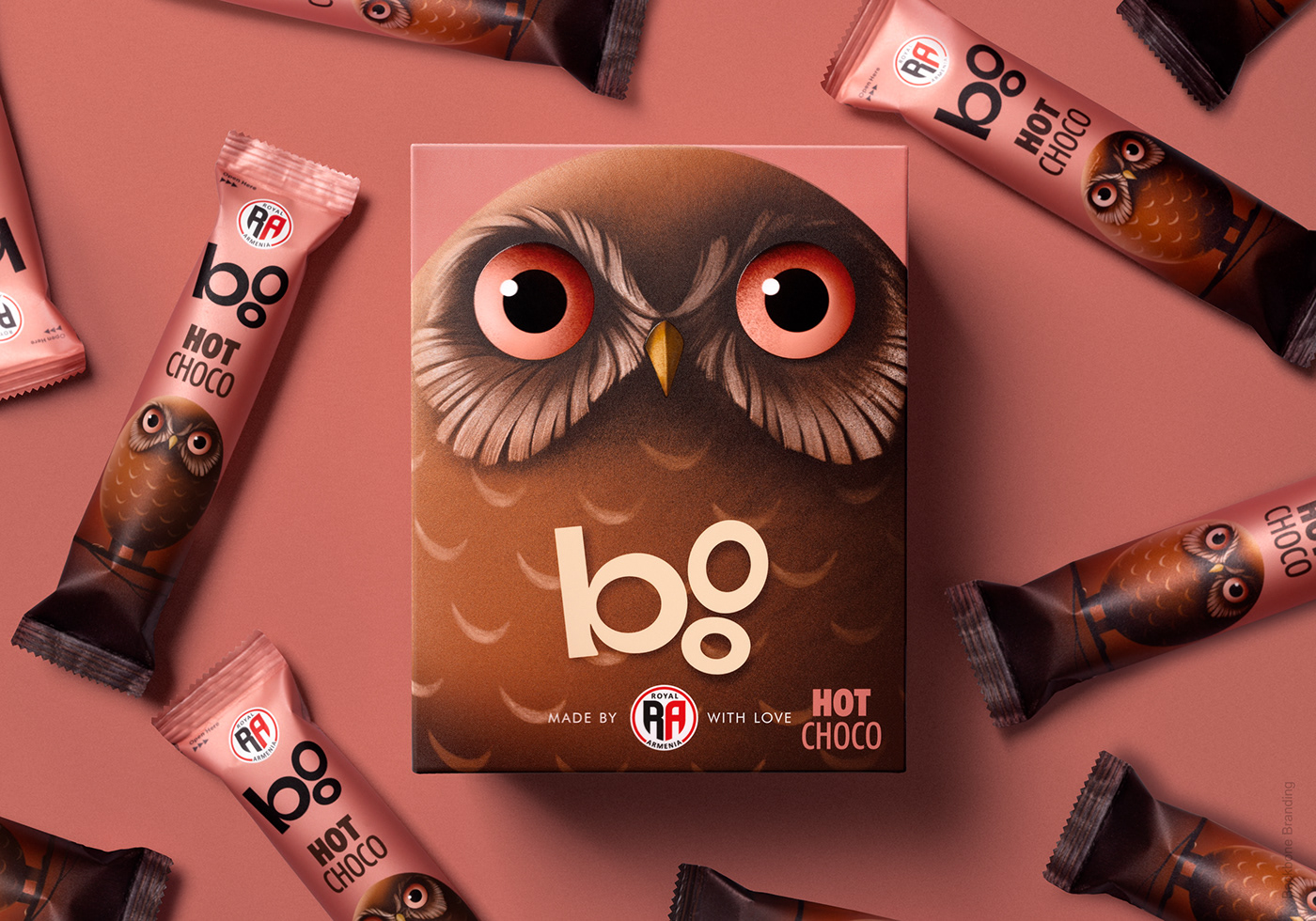
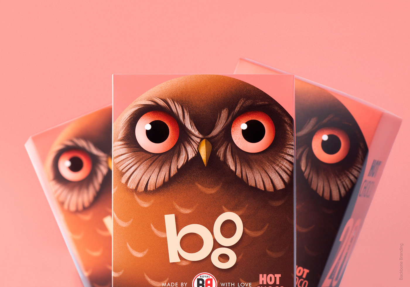
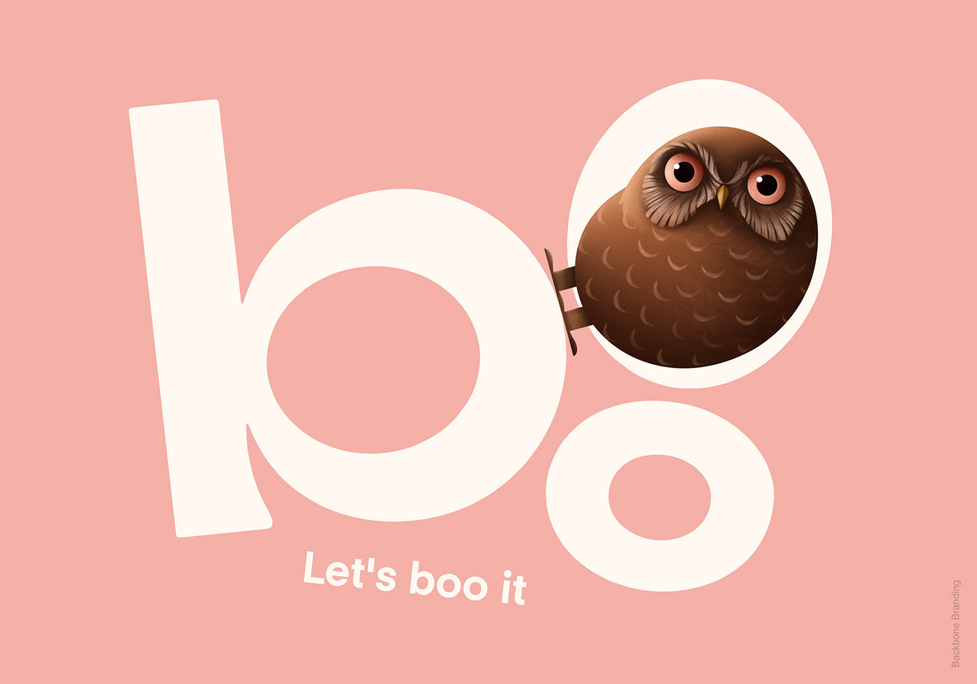
Boo
An illustration of an owl has been gracing the packaging of Royal Armenia coffees for many years. It has made the product so recognizable that people refer to it as "boo" (which means "owl" in Armenian).
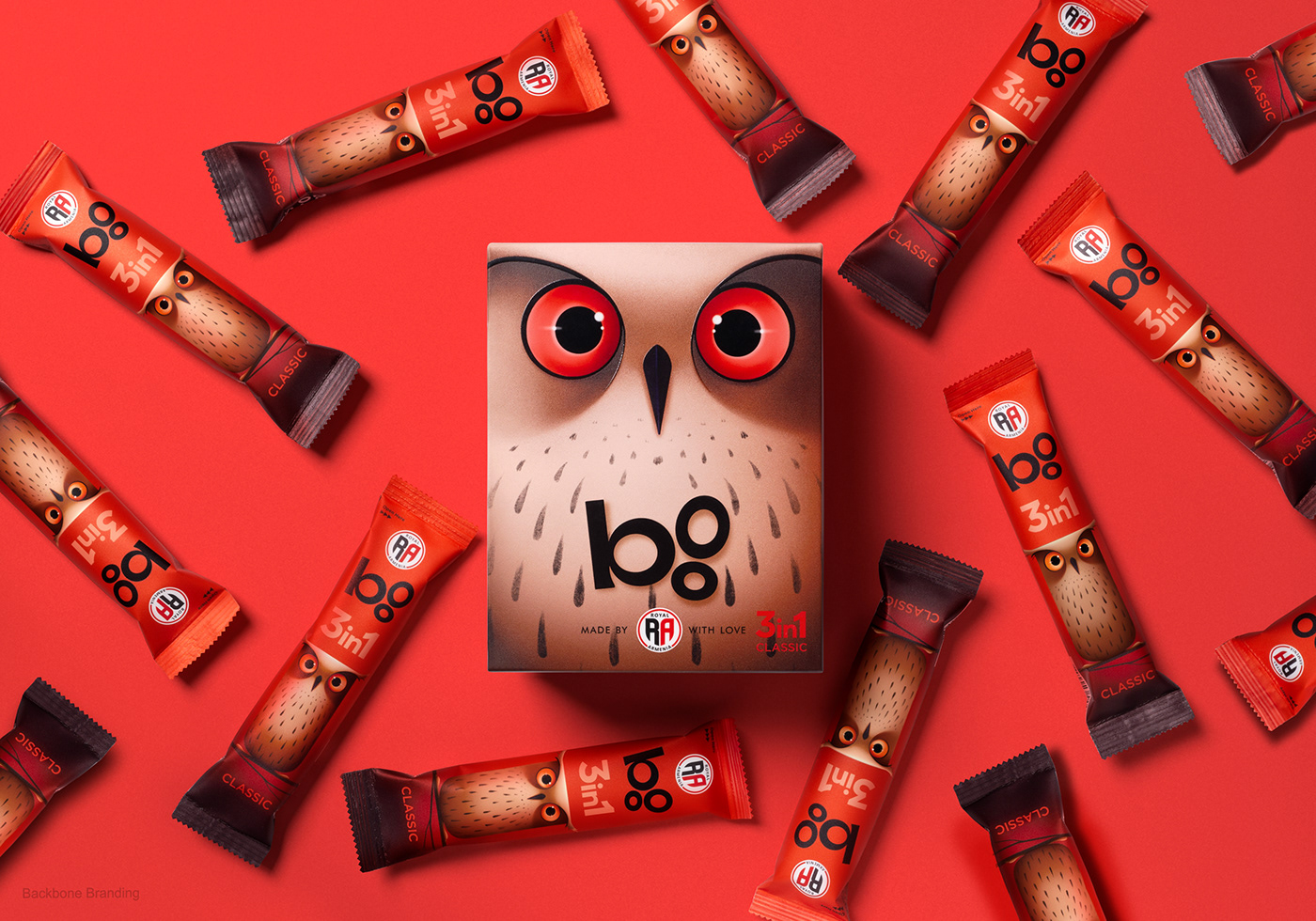
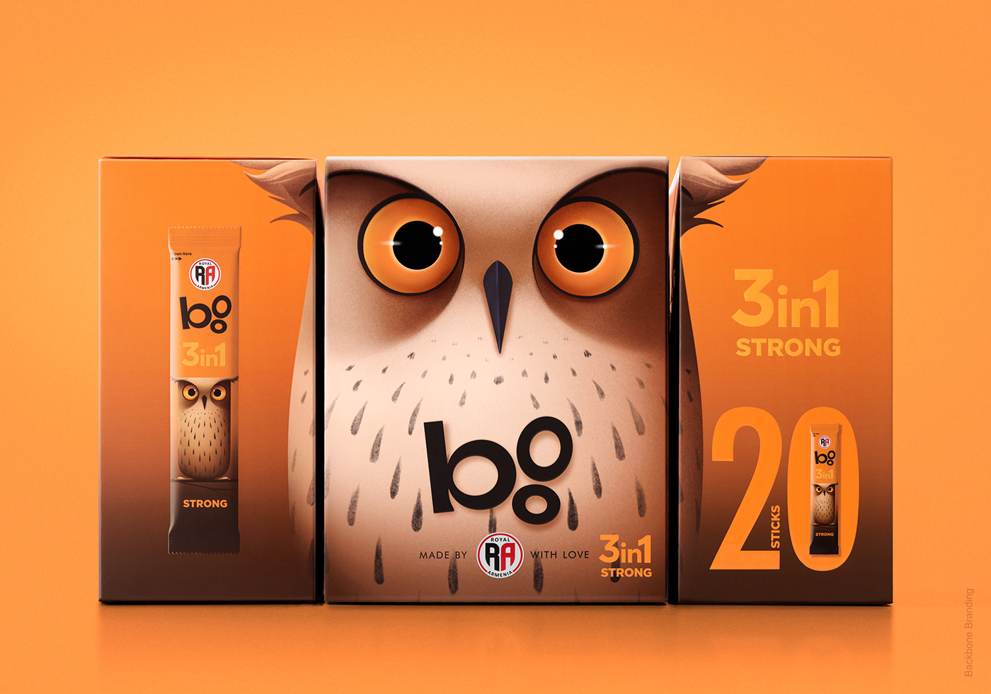
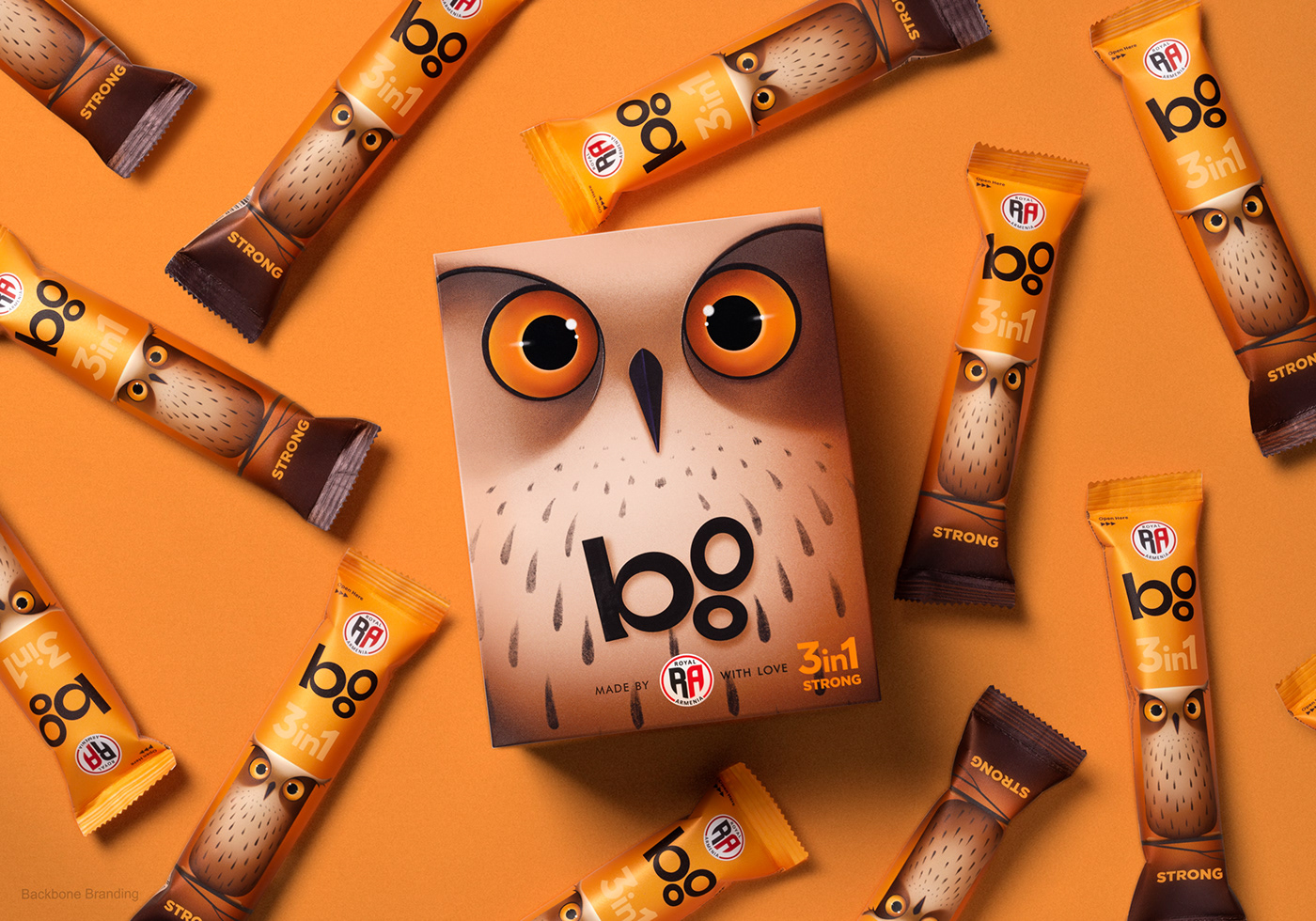
Royal Armenia approached us with the challenging task of redesigning the packaging for their line of coffees and iced teas, as the current design felt outdated. They asked us not to lose the brand's identity and to keep the beloved owl as a part of the design.
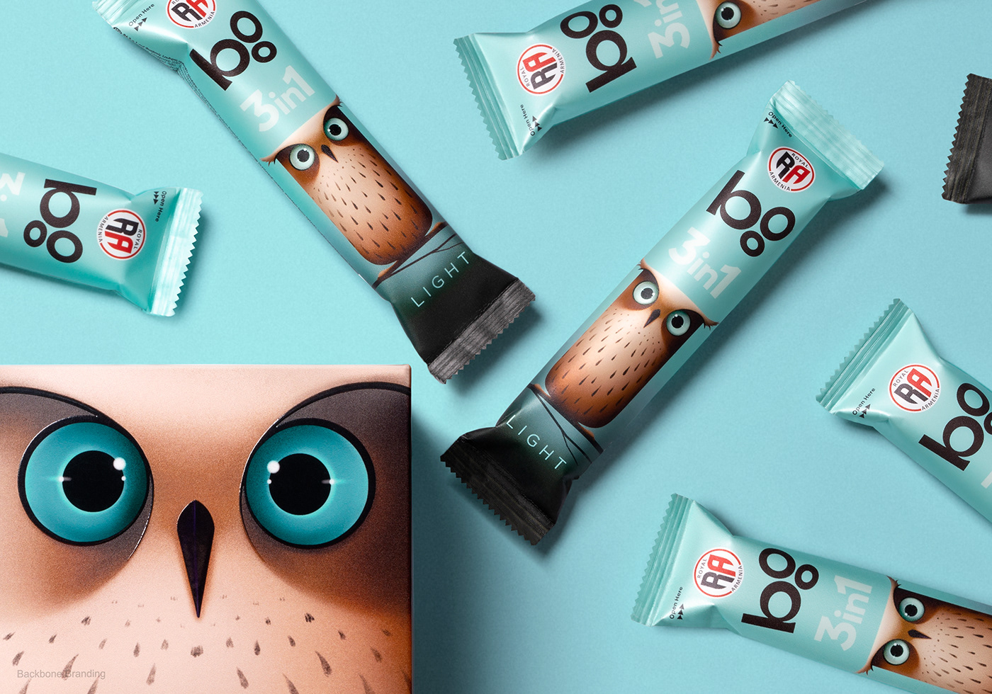
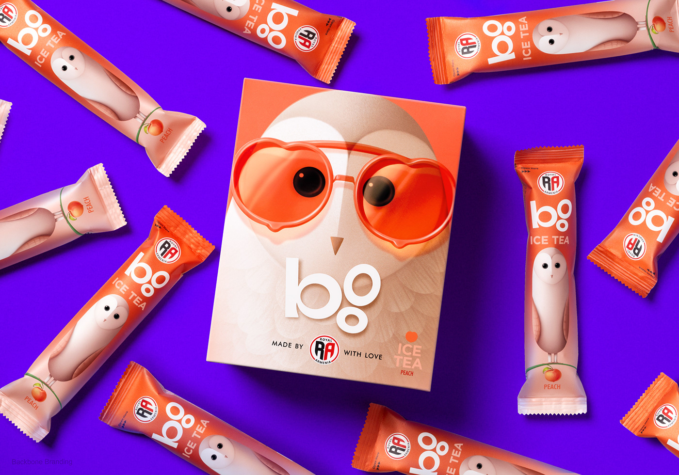
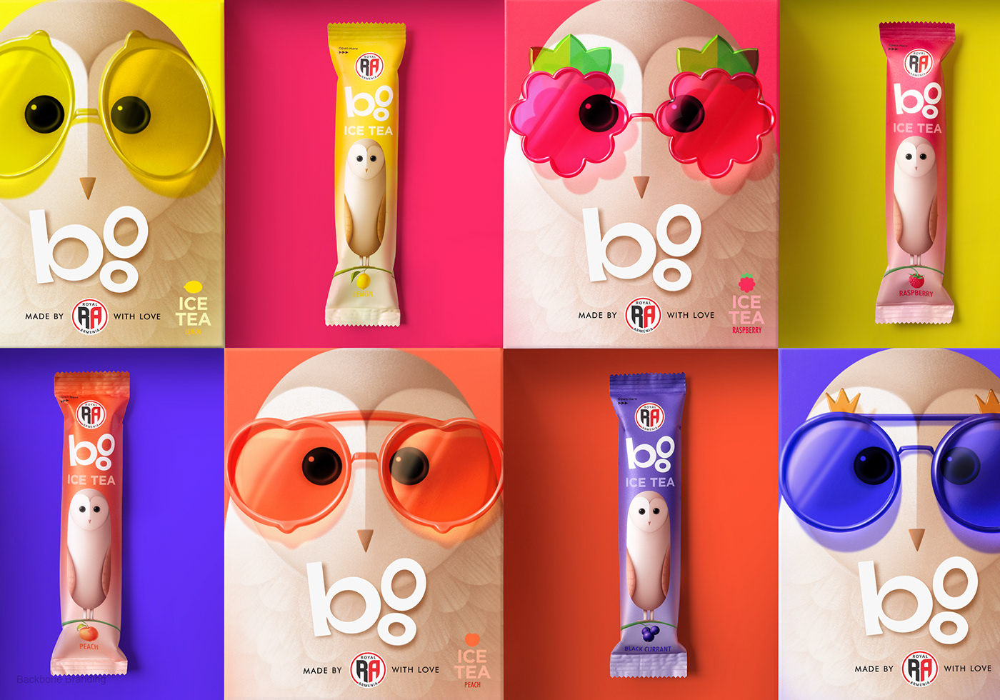
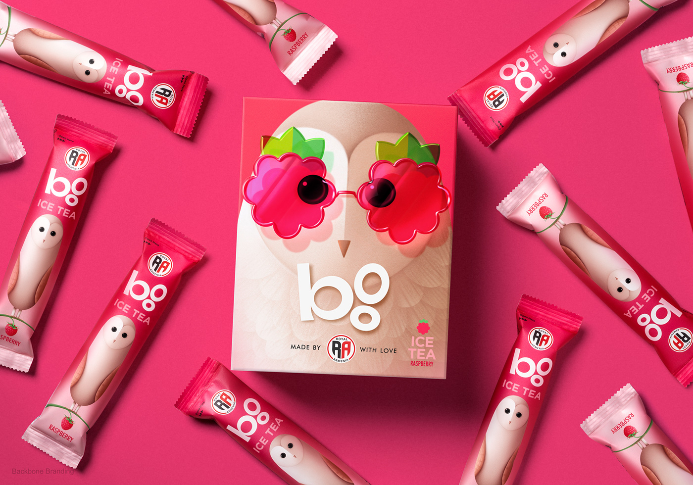
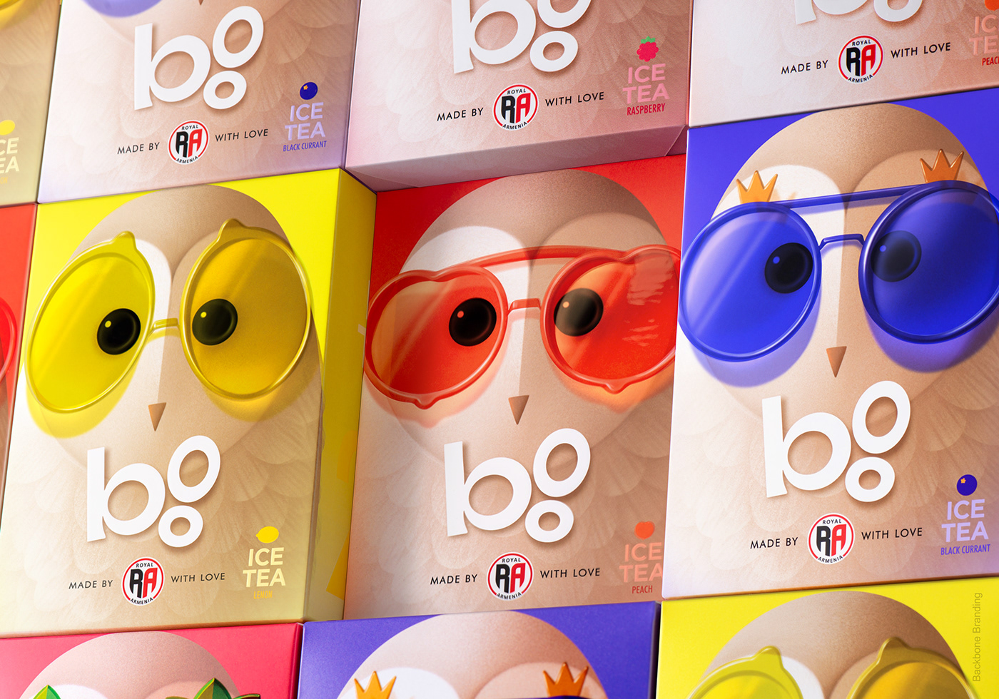
We made a strategic decision to create a subbrand called "Boo" (owl), using the same name people have been calling it for years. "Boo" was also turned into a typographic logo.
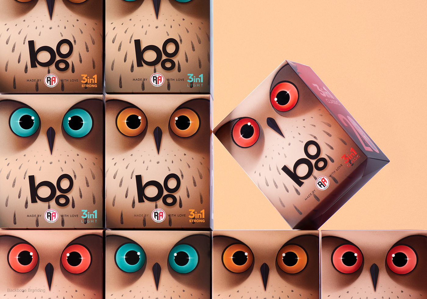
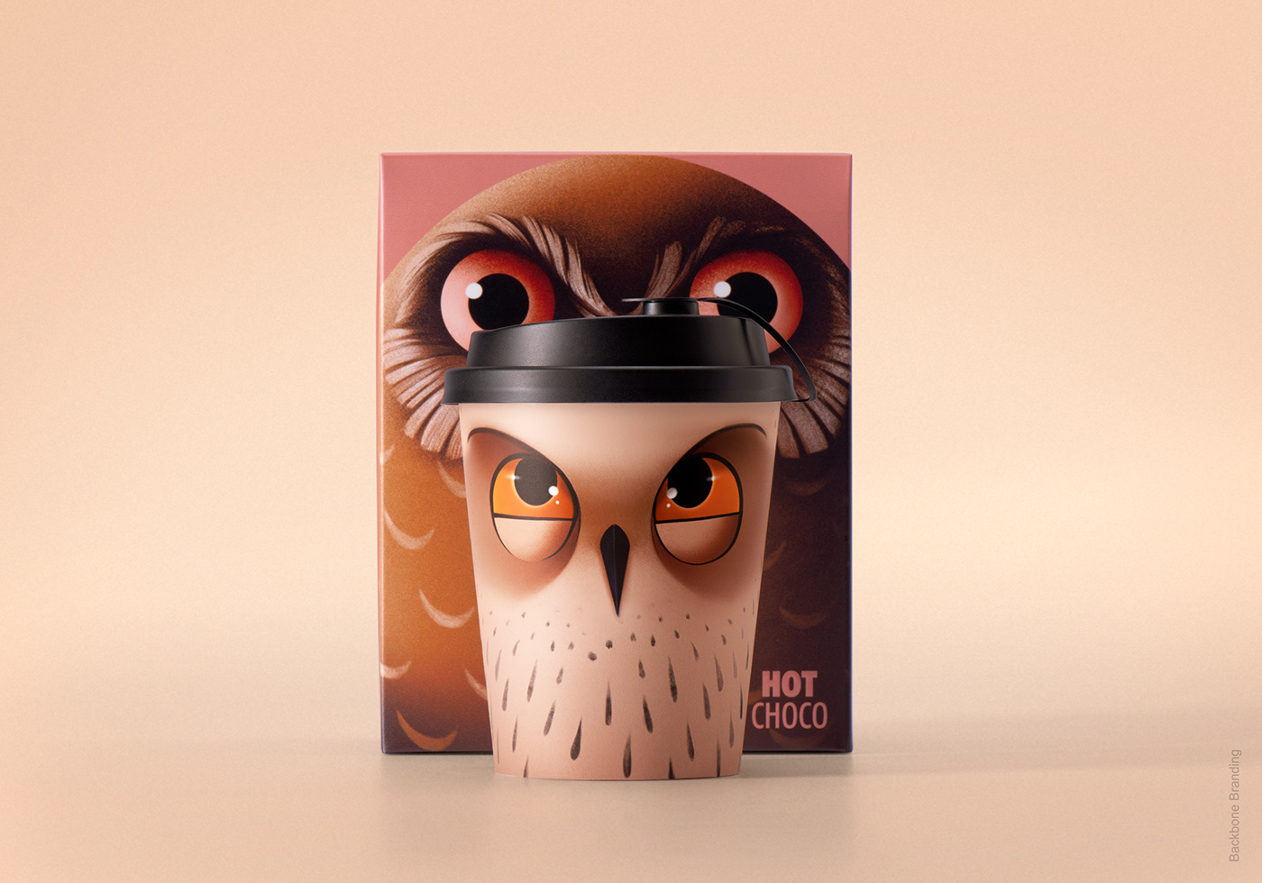
We completely redesigned the owl, making it the hero of the packaging concept. The new owl is more playful, bigger, and fresher. We also created two new owl characters for other product lines. We used the color logic from the old packaging to differentiate the types of coffee and applied it respectfully to the eyes of the owl characters. Additionally, the owl characters representing our ice tea line wear glasses in different colors and frames, which symbolize the respective fruits and flavors of the tea.
Credits:
Creative Director: Stepan Azaryan
Illustrators: Elina Barseghyan, Mariam Stepanyan
Graphic Designer: Ashot Hayrapetyan